Long Term Outlook for the U.S. Stock Market (10-09-2015)

Back in March, I wrote that I was expecting a 10-20% correction during the summer. In that post, I described how I saw a George Lindsay technical pattern called the Ascending Middle Section playing out on the Dow. I first learned about Middle Sections on Carl Futia’s blog in 2009. He identified a pattern that occurred during 2005-2008.

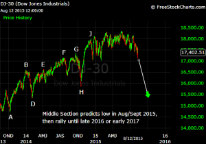
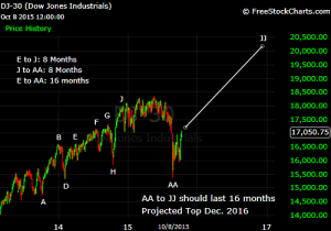
Here is a current chart of the Dow with my Middle Section count. Click the charts for a clearer image.

dow middle section shorter image

Dow Middle Section October 2015

In March, I decided to label December 2014 as Point J. Even though the market crept to new highs in the spring, the market acted like it was in a correction rather than an impulse, so I consider December to be the “fundamental” top of the uptrend.

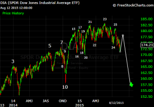
The Middle Section predicted that the time from Point J to Point AA would equal the time from Point E (Apr. 2014) to Point J. That relationship worked perfectly in this instance; both E-J and J-AA were 8 months! Given the strong rally over the past week, more evidence that the correction is over comes from the fact that the August crash hit the price targets projected by the Three Peaks Domed House patterns I labeled here.

The Middle Section also predicts that the time from Point AA to JJ will equal the time from Point E to Point AA. In our case, that implies a 16-month rally. Assuming the 16 months began in August, a top is forecast for December 2016.

There is substantial evidence that the top in late-2016 or early-2017 would be the end of this bull market. The AA-JJ rally on the Middle Section would correspond to a fifth wave on my Elliott Wave count from the 2008-09 lows, completing the bull market.

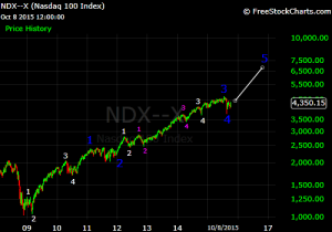
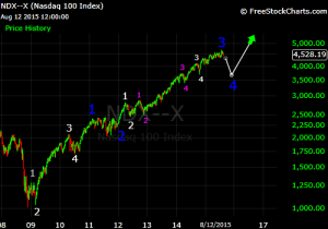
I have been using the NASDAQ-100 (NDX) for my Elliott Wave count as I think it shows the clearest pattern (Primary Waves are labeled in blue):

ndx elliott wave oct 2015

What are price targets for Primary 5? Any estimates are ballpark, but we could look for a relationship between Wave 5 and Wave 1. Primary 1 (Nov. 2008 – Feb. 2011) carried the NDX up 117%, over a period of 27 months. If Primary 5 lasts for 16 months, that would be a duration of 0.59 X Wave 1, which would give a percentage gain of 69%. That implies a bull market high of 6,400 on the NDX.

For the Dow, I think the bull market began in March 2009. If I apply the same methodology as I did with the NDX but use point gains instead of percentage gains, I get a target of about 20,000 on the Dow. If I use percentage gains, I get a target of about 26,000 on the Dow.

The NDX has risen so much during this bull market that I think percentage analysis is more appropriate than point analysis. However, point-based relationships might still be valid on the Dow.

But, regarding long-term outlook, there is an alternative situation that I should mention. I think there is a 33% chance that Primary 5 will turn out to be an extended fifth wave. The idea behind an extended wave is that the subwaves have the same duration and magnitude as primary waves. Thus, what you get is a bull market with essentially nine primary waves instead of five primary waves. Why do I think there could be an extended wave? There are two reasons.

The first is that popular sentiment regarding the economy and stock market has been strongly bearish throughout this bull market. Normally, by the end of Primary 3, the general public would be warming up to the market again. But my observations show only slight improvement in public sentiment since 2009. Typically, long bull markets (ones lasting > 5 years) end when the general population is very enthusiastic about the stock market and the economy. But I don’t see that happening any time soon.

The comments sections of media articles are loaded with comments denying that there is any economic recovery at all. It’s not just skepticism of headline numbers; many commenters even reject alternative statistics such as the more comprehensive U6 unemployment rate which also shows unemployment coming down. Opinion polls listed on Real Clear Politics show that nearly 66% of the population thinks the U.S. is headed in the wrong direction. Donald Trump, who would not be given any chance to win by conventional political analysis, is at the top of the Republican primary polls. This shows that people are deeply unsatisfied with the country’s status quo and want major changes in leadership.

The second reason I see a chance of an extended wave is that, we have not gotten a single interest rate hike from the Fed even though it has been six years since the economy bottomed out. Now, I do not subscribe to the idea that the Fed controls the stock market through monetary policy. Instead, I think that the Fed’s monetary policy affects economic expectations, which in turn affects earnings expectations, which in turn affects stock prices. However, if monetary policy fails to make a big difference on economic outlook (as was the case in early-mid 2008), the chain reaction stops.

Anyhow, in the present market cycle, if inflation stays low and the Fed does not hike rates sharply in the coming years, any recession in the near future is likely to be relatively mild, and with public sentiment already being bearish, a mild economic contraction might not derail the longer term bull market.

If this is an extended bull market, it would probably last until the mid-2020s. I know that sounds wildly optimistic, and I myself share that feeling, which is why I have only given the scenario a 33% chance. But it’s something to keep in mind given the current situation.

The Correction is Over (10/05/2015)

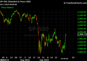
Given the sharp rally that we have seen over the past few days in all of the major indices, I have come to conclude that the correction is over.

spx successfull retest oct 2015

Notice that the S&P 500 had a very close retest of its August low and then engaged in a very sharp rally. Given that we had what looked like a complete, 3-wave corrective pattern from Aug. 24 to Sept. 17, followed by a classic breakdown, it would be very atypical to have a sharp, sustained rally like we have just seen if this is just a counter-trend rally.

Thus, I consider this rally to be the start of a new uptrend. When I have more time, I will make a detailed post on my outlook for the market over the next two years.

U.S. Stock Market Update – August 12, 2015

Since my last update on July 6, the U.S. stock market has performed very much as I expected. The only difference is that it took a little longer for the downside to accelerate, so the correction may terminate in September rather than this month. I expect the Dow to bottom out around 15300-15800.

To recap my intermediate-term rationale, I have three charts labeled below with links to sites where you can learn more about the corresponding patterns. Click on the charts for a clearer image.

Three Peaks and a Domed House
dia tpdh august 2015

Ascending Middle Section:
Dow middle section August 2015

Bull Market Elliott Wave Count:
ndx elliott wave aug 2015
Of all the major indices, I think the NASDAQ-100 (NDX) shows the clearest Elliott Wave pattern.

Lastly, I should mention that we are approaching the 28th anniversary of the 1987 crash. For some mysterious reason, there seems to be a phenomenon in which drops of 20+% are separated by roughly 28-year intervals. I previously discussed this here.

Triangle Patterns (Feb. 12, 2015)

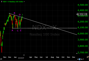
Two major stock indices have classic descending triangles that began in December and likely ended earlier this month. First, here’s the NASDAQ-100 (NDX):

NDX triangle

The NDX has decisively broken out above the upper trendline which is a very bullish signal for the coming months. After an upside breakout, the next major top tends to occur near the point where the trendlines converge. In this case, that suggests a rally until late-August.

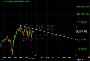
The Dow Jones Transportation Average (DJ-20) has the same triangle pattern:
Dow20 Triangle

The trendlines for the Transports predict a significant top in early September.

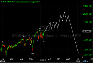
You may remember an earlier projection I had for a major top in May based on the Dow Industrials’ Three Peaks Domed House:

Dow tpdh 2015 updated

I arrived at May by counting 7 months from Point 10. Normally, the 7 months is counted from Point 14, but I thought this instance had omitted Point 14 due to the height of the rally off the October 2014 lows. However, if the stock market is going to rally until the late-summer as the triangles suggest, then the recent low on the Dow could be point 14. Counting 7 months from February puts us in September, the same month that the triangles’ trendlines converge. We will likely see Dow 20,000 headlines by the end of the summer.

Another interesting observation is that the 2nd half of this year is when the Federal Reserve is expected to tighten interest rates. Everyone seems to think higher interest rates will cause stocks to go down. I have some doubts about this correlation (short-term volatility aside), but, technical patterns suggest that the market could be in an overbought and vulnerable position this fall, so news shocks could suspend the bull market for a while.

Europe

In recent years Europe has been a major focus of financial media. Europe has experienced much more difficulty than the U.S. emerging from the global financial crisis, with many European economies being in-and-out of recession ever since 2008. An interesting observation is that, despite the economic stagnation, most European stock indices have been rising. The bull markets have been more subdued than the U.S., but what this suggests to me is that European stocks are still in the early phases of a very long bull market, with more years of upside left than the U.S.

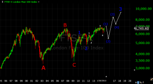
First, here’s the U.K.’s FTSE-100 index:

FTSE long term Elliott Wave

It looks like the FTSE had a large-scale bear market during 2000-2009 which took the form of a flat, and a new bull market started from the 2009 low. Even though the 2003 low was never broken nominally, the inflation-adjusted FTSE did go below its 2003 low in 2009, which is why I have labeled 2009 as the bear market low.  The first Primary wave of the new bull market was from March 2009 to April 2010. Then there was an expanded flat Primary Wave 2 during Apr. 2010 – Aug. 2011. Primary Wave 3 began from the Aug. 2011 low. Even though the rally since then has been long enough time-wise to qualify as a primary wave, the index isn’t far above its 2010/2011 highs yet. Thus, I think this third wave will turn out to be an extended third wave, in which each of the five subwaves are the magnitude of primary waves. This is a well-known phenomenon in Elliott Wave theory, and more detail about it can be found here. For the FTSE, I think the first leg of the extended wave will conclude within a few months followed by a correction of 20-30%,  similar to the 2011 drop. Support will likely be found around the July 2012 low at 5200. After that, a very strong advance should begin in the FTSE.

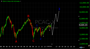
Next, I have the chart of France’s CAC-40 index:

CAC-40 long term elliott wave

It’s basically the same pattern as the FTSE.

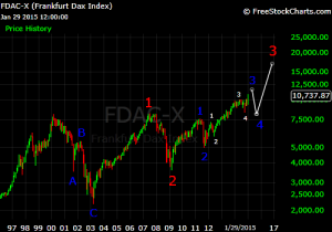
Germany’s DAX index shows a different pattern:

DAX long term Elliott Wave

The DAX appears to be in a large-scale bull market, with highest-order subwaves more like Cycle degree than Primary degree. I think this was also the case for the U.S. bull market of 1982-2000.  The DAX appears to be in Cycle Wave 3 of a bull market that began in 2003. Within this wave, the DAX is probably near the top of Primary Wave 3. After a Primary 4 drop, the DAX should rise for at least two more years to complete Cycle 3. I should note that I diverge from conventional Elliott Wave theory in that I do not believe in an eternal fractal pattern in which every bull or bear market is part of a larger degree pattern. I have found that it is more helpful to consider each bull and bear market as an isolated event.

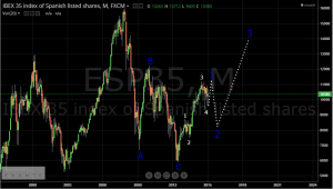
Next I have a chart of Spain’s IBEX-35 index:

IBEX 35 long term Elliott Wave


The IBEX was in a bear market from 2007-2012. Unless proven otherwise, I think it makes the most sense to assume that the bear market ended in 2012 given that it had a classic 3-wave decline and a long duration of five years. However, it looks like the IBEX is in the fifth Intermediate wave up from the 2012 low, which implies it is close to the Primary 1 top.  From an intermediate-term perspective, this is a dangerous situation given that other European indices had Primary 2 declines of 25-40% back in 2010-2011.

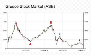
Next we’ll look at Greece:

Greece stock market long term Elliott Wave

The ASE appears to still be in a huge expanded flat that began in 1999. The C Wave appears to be subdividing into five waves (which is expected in a flat), with the fifth wave decline underway now. The ASE will probably fall below its 2012 low later this year and then begin a long term bull market.

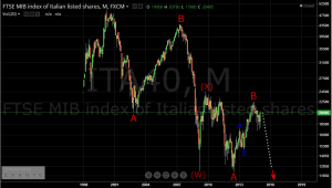
Last we’ll look at Italy:

MIB long term Elliott Wave

The MIB appears to be in a double-zigzag bear market that began in 2000. It appears that a terminal C Wave is underway now to complete the pattern and will result in a decline below the 2012 low.

A Macroeconomic view:

The European stock market performances and Elliott Wave counts make sense from a Macroeconomic perspective. Germany has been one of the most stable European economies, and it also has the most bullish Elliott Wave pattern. Italy and Greece have been two of the weakest economies, and their stock indices have ongoing bear market patterns. The U.K. and France are somewhere in the middle economically. Correspondingly, their stock indices have bull market patterns but are more subdued than Germany so far.

Elliott Wave theory generally expects that visible economic improvement will begin at or before the midpoint of a bull market’s third wave. For the U.K., France, Germany, and Spain, this implies that a strong economic advance will began within the next year or so.

Sources of stock index data:

FTSE, CAC, DAX – http://www.freestockcharts.com

MIB, IBEX – http://www.tradingview.com

ASE – http://www.tradingeconomics.com

Inflation-adjusted index data – http://www.aboutinflation.com


The 28 Year Cycle

I am generally leery of cycle theories that involve fixed intervals of years. Many of them are rooted in astrology and planetary cycles which I do not believe influence world events. However, it is possible that some of these time intervals could coincidentally be pertinent to the stock market for socioeconomic reasons.

One time-interval that does seem to have significance is a 28-year interval from one important high to another, and from one important low to another, first discovered by George Lindsay, a famous market technician of the previous century.

The 28-year cycle is significant now because 2015 is 28 years from 1987, in which there was a 2-month crash during Aug-Oct that dropped the Dow 41%. Thus, 1987 had both an important high and low, so the 28-year cycle suggests an important top, bottom, or both during 2015-2016.

Here are some previous instances that I have identified (give or take a year). All of the lows came after drops of at least 17%, with many being 20-30%.

Lows of 1982 & 2010 (or 2011)

Highs of 1980 & 2007

Lows of 1974 & 2002

Highs of 1973 & 2000

Lows of 1970 & 1998

Lows of 1962 & 1990

Highs of 1959-60 & 1987

Corrections of 1956-57 & 1983-84

Lows of 1946 & 1974

Lows of 1942 & 1970

Lows of 1938 & 1966

Lows of 1932 & 1960

Lows of 1921 & 1949


See my previous posts for more information on 2015.

If the uptrend is to continue, we need a bottom soon

There are three technical patterns that I am following now:

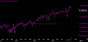
1. An Elliott Wave count on the Dow, S&P, and NASDAQ:

Dow Elliott Wave 2011-2014

2. An Ascending Middle Section on the Dow:

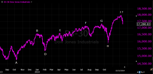
Dow Ascending Middle Section 2014

Idealized Pattern here:

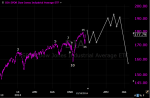
3. A Three Peaks Domed House Pattern on the Dow:

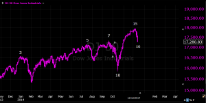
Dow tpdh 2014

Idealized Pattern here:

The phase of the bull market from 2011 onward could easily be considered complete based on the Middle Section and the Elliott counts. The Three Peaks Domed House is the only pattern which implies continued upside. If the TPDH is still playing out, we have just begun the “five reversals” (points 15-20).

The Dow and the S&P are currently down about 4% from their highs. On my Elliott Wave
count, we are in an Intermidate-degree 5th wave following a rather extended 3rd wave. In my opinion this is a vulnerable phase, and I would not expect a subwave drop to be much bigger than what we’ve had so far.

If the selloff doesn’t slow down , or if the next big drop isn’t immediately followed by a strong rally, most likely a correction of 15-25% lasting 7-8 months has begun.

Some New Patterns and Targets – November 2, 2014

Hi everyone,

As described in the previous post, I have updated my Elliott Wave counts for the Nasdaq-100 and the Dow to allow a continued rally in response to the strong upside recently. As for the Three Peaks and a Domed House patterns that I had been tracking on the NDX, the larger pattern’s final decline fell far short of the expected target. However, the smaller pattern did come to a completion as the index took out the August low by a large margin.

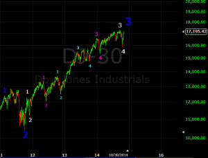
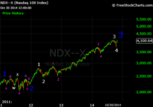
Here are my current Elliott counts:

Dow:

dow primary 3 updated

NDX:

ndx primary 3 updated

I think both indices are in a Wave 5 of Intermediate degree. The question becomes, how high will Wave 5 rise? That is often difficult to determine. Occasionally,  after highly extended 3rd waves as we saw in this cycle, the 5th wave fails to even make a new high. Assuming the market does make a meaningful new high, a target that Elliotticians often watch is the level in which Wave 5 equals Wave 1. On an arithmetic point basis, such a relationship implies very limited upside from current levels (only about 100 points on the NDX, 500 points on the Dow, and no substantial upside on the S&P 500). Therefore, any drop that exceeds 5% with accelerated selling should be taken seriously and would probably signal the start of a Primary 4 correction.

However, a logarithmic analysis of the market provides a more bullish outlook. On the log chart, a Wave 1 = 5 relationship would give us a target of about 18500 on the Dow, 4700 on the NDX, and 2200 on the S&P 500.

If upside continues from here, the Dow appears to have a prospective Three Peaks Domed House pattern developing:

Dow three peaks domed house

The “domed house” rally of the pattern tends to last roughly as long as the “three peaks phase”, which in this case would imply a top during the 2nd quarter of 2015.

In addition to Three Peaks Domed House, I just recently identified a prospective instance of another George Lindsay pattern (the Ascending Middle Section) on the Dow. This pattern is rather complicated to explain, so I’ll make a separate post about it soon.